Two-tone kitchens have become one of the most requested looks in kitchen design, and it’s easy to see why. A single colour palette can feel flat in a large space, while two well-chosen tones add depth, contrast and a sense of intention that a one-colour kitchen sometimes struggles to achieve. Done well, it looks considered. Done poorly, it looks like two separate decisions that were never meant to sit together.
Two-tone doesn’t mean picking two random colours and hoping for the best. It usually means splitting the cabinetry into two distinct zones, often uppers and lowers, or an island against the rest of the kitchen, and giving each its own colour or finish. The two tones work together, not against each other, which is where the real skill in this trend lies.
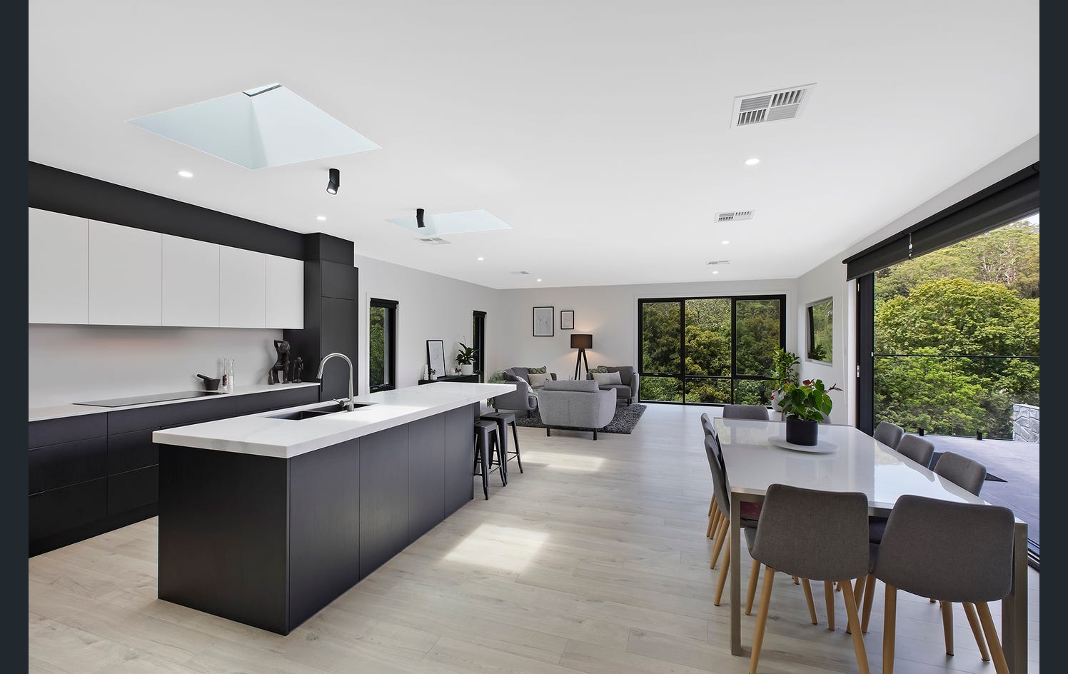
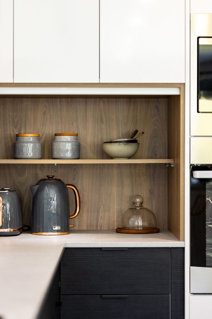
The most popular approach pairs a darker lower cabinetry with lighter upper cabinetry. This grounds the kitchen visually, since darker tones near the floor read as more stable and lighter tones near the ceiling keep the space feeling open.
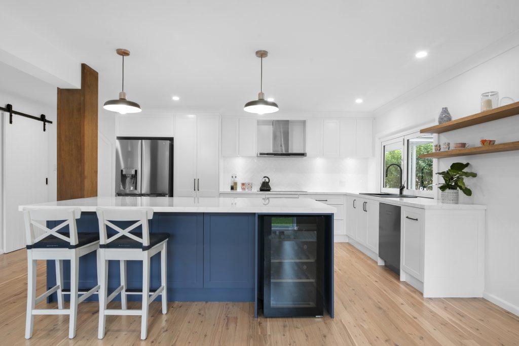
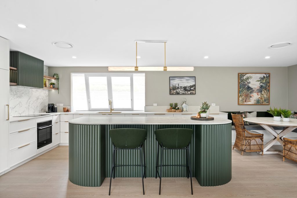
Another common split uses the island as the contrast piece. A neutral palette runs through the perimeter cabinetry, while the island takes on a bolder colour, a contrasting timber tone, or a different finish altogether. This draws the eye naturally toward the island as the feature of the room, which works particularly well in open plan kitchens where the island doubles as a social hub.
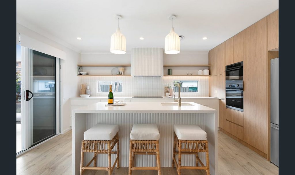
Some kitchens split by material rather than colour, pairing timber veneer cabinetry with a painted finish, or matte with gloss, rather than relying on colour contrast alone.
The safest and most enduring two-tone combinations tend to share an undertone, even if the colours themselves sit at opposite ends of the spectrum. A warm white paired with a warm timber tone will generally look more cohesive than a warm white paired with a cool charcoal, simply because the undertones are fighting each other in the second pairing.
If you’re unsure where to start, look at your benchtop, splashback and flooring first. These are the elements that stay constant, and your two cabinetry tones should work with them rather than compete against them.
The biggest mistake in two-tone design is choosing two colours with equal visual weight and no clear hierarchy between them. When both tones compete for attention, the kitchen can end up feeling busy rather than considered. One tone should generally lead, with the second acting as a supporting contrast rather than an equal partner.
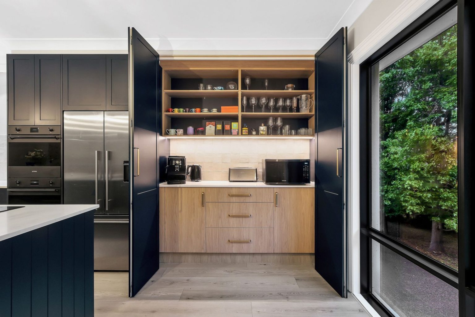
Hardware is another detail that gets overlooked. Handles, tapware and even appliance finishes need to sit comfortably alongside both cabinetry tones, not just one of them. A gold handle that looks beautiful against a dark green lower cabinet can look completely out of place against a stark white upper cabinet if it wasn’t considered as part of the whole palette.
There’s a common assumption that two-tone kitchens are harder to keep looking good, but this usually comes down to the specific finishes chosen rather than the two-tone approach itself. A well-selected combination of durable, well-matched finishes will hold up just as well as any single-tone kitchen.